VNYL
Mobile-first Website Redesign Case Study
by
Sara Hadi
UX Designer, Researcher. DEIA Advocate

Type
Academic Project (Group)
My role
Research Lead
What I Did
User/Business Research and Synthesis
Project Management
Time Frame
3 Weeks Sprint
Summary
The project was for VNYL, a subscription service looking for ways to make record listening more accessible and implement UI patterns to automate certain parts of their curation process.
Our team delivered design solutions based on task flows showcasing automated curation with emphasis on the user being able to control the process. The deliverables included a complete report on user research and market analysis, a Mid/Hi-fi Prototype with iterations based on a round of usability testing, and mockups with detailed annotations of proposed features.
team Members

project highlights
the brief
VNYL believes every piece of vinyl tells a unique story. The service hand-curates three albums; each shipment based on the user’s interests, which they can build up on by discovering new vinyl records on their Spotify account.
The Problem
VNYL has had some difficulties with their website in terms of users understanding how to navigate through the album selecting process. In addition, their current model requires an employee to select curated albums for customers upon request.
The Solution
My team and I conducted a three-weeks sprint, focusing on how we might make the service more scalable if they were to keep growing as company and also make record listening more accessible to people. Below are some of the highlights of the project deliverables.
The full scope of the project can be viewed in the Figma File.
The Mid-Hi fidelity prototype can be accessed here.
Step by step scrollable onboarding for increased engagement
Preexisting Sign-in options for upfront data collection
Revamped Music Profile page for service automation
Embedded Spotify playlist for central usability
the scope for research
The project was initiated with creating a project timeline and a general structure of the plan that would be revised and followed throughout the sprint:
Click on the image above to view the full scope of the project plan
The idea was to keep the user problem and the business problem alongside, so that the major roadblocks towards usability could be identified at both ends. The initial research plan contained methodologies that could yield insights into both the user and the business problems.
Click on image to enlarge
key research Findings
The main objective of the user research was to discover the pain points of selecting vinyl albums to curate according to the user’s individual interests. For conciseness, only the insights from the research are shared in this case study. For a detailed look at the process and a complete report, refer to the Project Figma File.
Interview Insights
Users choose vinyl to CONNECT to:
- the past with a sense of nostalgia
- music physically through a more immersive experience
- their favorite artists by directly supporting them
Users DISCOVER vinyl to buy:
- through streaming recommendations or through family/friends
- by frequenting local record shop and sorting through bins by genre
- online, but only if they want a specific or exclusive album not available in person
Users consider PRICE
- at every stage of the process
- a hindrance when they first got into collecting records
Survey Insights
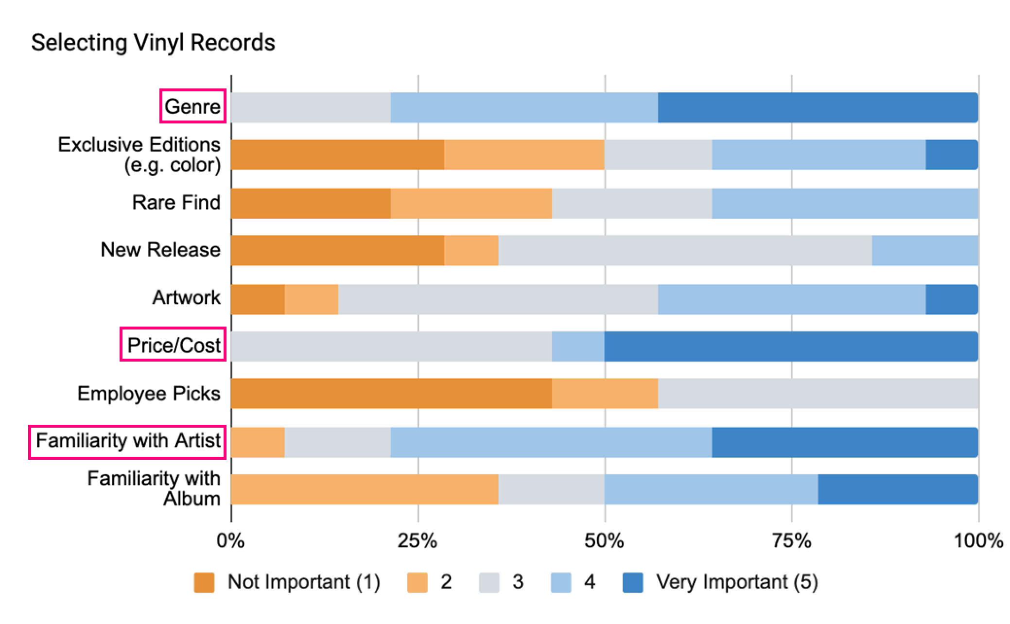
With the aim to gather quantitative data on what users looked for when purchasing vinyls, the following factors were uncovered:
GENRE was the most important, with none of the 25 respondents indicating it lower than a 3 on the Likert scale of importance.
FAMILIARITY of the artist was also more important than familiarity of the album.
And again, 50% of respondents indicated that they considered PRICE to be very important when selecting a vinyl.
the Business analysis
The starting point was knowing that the service had difficulty with their website in terms of users understanding how to navigate through the album selection process for curation. Some other issues that came to light after conducting a complete heuristics evaluation were as follows:
Broken links
Confusing language
Visual design inconsistency
Unaddressed reviews from unsatisfied customers
Three different URLs with none linked back to homepage
For a detailed look at the heurists analysis, view the PDF file.
How VNYL compares
What with plenty of direct and competitors out in the market, a comparative analysis was pertinent for understanding what worked well and where VNYL was lacking. A quick comparison is shown in the table below, however a detailed comparative report can be viewed here.
As evident from the table, while VNYL stands out as offering a more personalized and discovery based curation, it fails to meet many service features that the other competitors are offering readily.
the user journey
Taking the user research into account, it was time to synthesize and correlate the research data with the current system’s design flow. A User Journey Map and a Service Blueprint were created for that purpose.
user journey mapping
The major takeaway from from the journey mapping was that the user needs to feel more secure about what VNYL is offering, especially its subscription services. For the complete User Journey Map, refer to the Project Figma File.
The Service Blueprint, in turn, provided the key insights into where the current process could be changed or optimized to obtain maximum productivity throughout the front and backend.
It was evidently clear now that the two data points for the curation process, that is, the user’s music profile in VNYL and the data from their Spotify account, needed to be made visible to the user on their profile page, instead of having them to toggle between the two platforms.
Looking at it from the business’ point of view, the data could be collected at the backend in one place as well, to suit the automation process as well as convenience the curator.
User Persona
To culminate the research synthesis, the user persona was created, keeping a music enthusiast in mind, for whom listening to music is an integral part of his daily routine:
the design process
For the redesign, it was decided that the focus would be on the three key pages, that is, the Landing Page, the user’s Music Profile Page and the Vibes Page, which was basically where the user defined their listening preferences. The rationale behind the decision was mostly based on the sprint’s time constraints and additional Mockups of other pages were also considered.
Landing Page
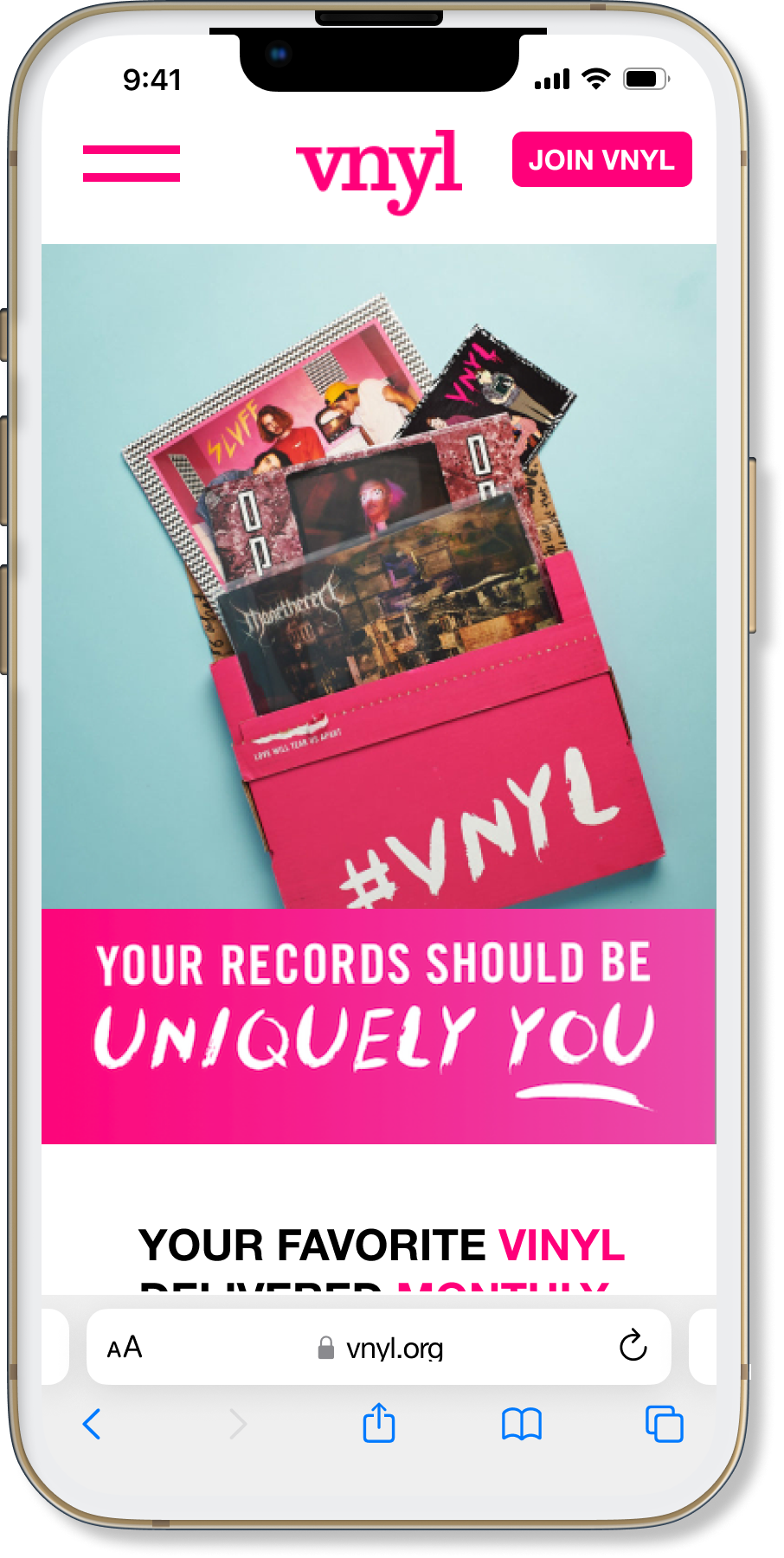
Current Design
Functional use of space
Revised Onboarding
Increased User engagement
Proposed Improvements
Music Profile
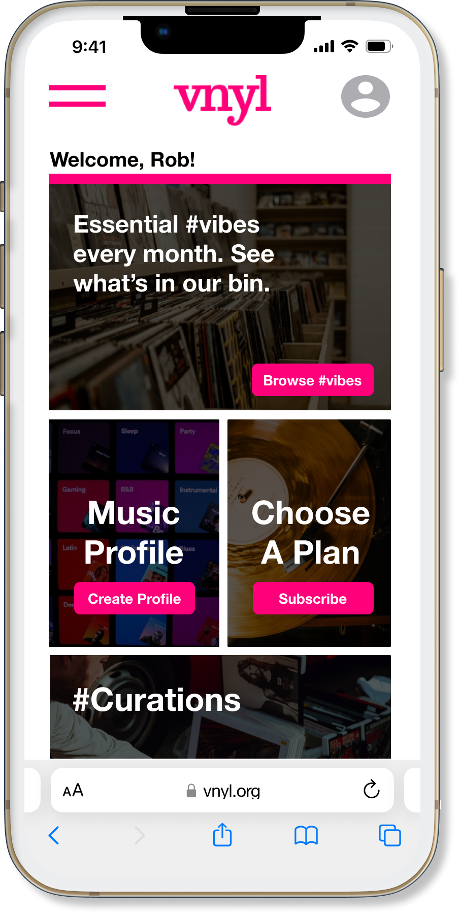
Current Design
Layout built on recognition over recall
Separate onboarding for choosing plans
Upfront data collection for automation
Proposed Improvements
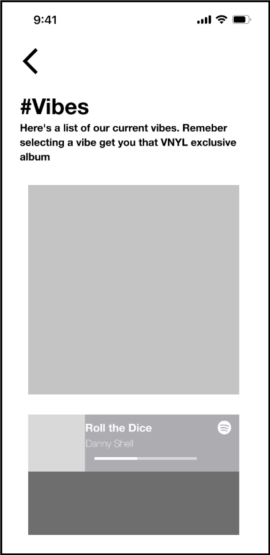
Vibes Page
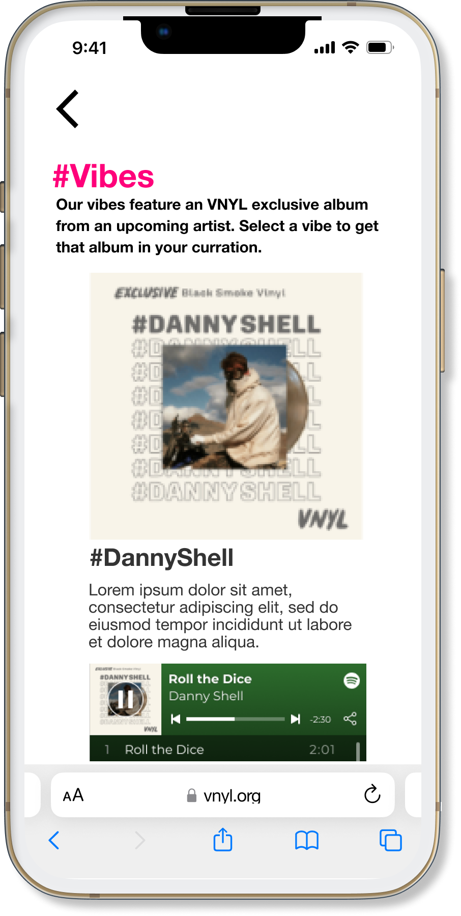
Current Design
Proposed Improvements
Vibe description (why chosen)
Embed Spotify playlist
Curation pref.(Algorithm /Human)
usability testing
For the usability testing of the lo-fi prototype, the KPI’s relied on the tasks success rate, the error rate, and the overall customer satisfaction of signing up and creating a music profile on VNYL through their mobile device. The results were as follows:
There was a 3.5 out of 5 satisfaction rate with the sign up process
There was a 100% task success rate
3 errors were located on the landing page
Furthermore:
Refer to the Project Figma File for a complete usability report.
second iteration
To clear some of the issues presented in the usability testing the following changes were made:
Changed “Get VNYL” to “Join VNYL” on the main CTA on the Landing page
Added confirmation popups after each task linking to user’s account/profile page. This ensured the user could complete the profile in stages if desired.
the deliverables
For the handoff, a comprehensive User Research was presented catering to both user and business requirements, as showcased in the case study.
The Mid/Hi-fi prototypes were created based on three task flows, which showcased the user goals of creating/viewing account page, creation of a music profile and choosing a vibes/subscription plan.
Additionally, two Mockups screens were also designed to propose the music profile page layouts, with detailed annotations of features and elements in each frame.
Reflections
For the next sprint, it was agreed upon that the following items would be considered as a priority:
New features:
Show potential curation options based on user data, so the user can preview what might arrive in next month’s shipment
Choose to be notified beforehand of what has been selected for you or choose to be surprised.
Suggestions to Client: Provide access to churn rate data and implement a feedback survey to current subscribers and Net Promoter Score (NPS)
Set up an efficient content management system to manage the influx of the monthly curated vibes and the user profiles.
References
Platforms other than Figma used in the project: Material Design, Miro, Maze, Google Forms, Google Slides, Google Sheets, Slack, Canva
Case study build on Squarespace. Mockups and other images edited using Figma.

