bmyvillage
Client Project Case Study
by
Sara Hadi
UX Designer, Researcher, DEIA Advocate

Type
Client Project (Group)
My role
Design Lead
Design System Creation
Project Management
User Research
what i did
Timeframe
3 Weeks Sprint
The project was for Bmyvillage, a virtual teacher coaching company in their growth phase and looking to implement design changes in an effort to prioritize end user needs and scale up.
Our team delivered a comprehensive user research, market analysis and 2 rounds of usability testing. The high fidelity mockups and prototype were created with a completely new design system and a handoff document for the developers as well as an accessibility guide.
Summary
team Members
Jessica Olson, Gabrielle Rodrigo, Kristin Faye Asuan-O'Brien
2.1 Overview
2.2 Key Research Insights
2.3 Secondary Research
contents
3.1 The Business Analysis
3.2 The User Journey
4. The Redesign
4.1 Wireframes
4.2 Usability Testing
4.3 Style Guide
4.4 Content Strategy
Introduction
About the Client:
Bmyvillage offers one on one virtual coaching-matching motivated teachers with highly successful, recognized fellow teachers. Bmyvillage was established in 2020 with an understanding that teachers needed support outside of what their districts were providing.
About the Project:
This was the final project in my UX Design Immersive course for General Assembly, where our instructors introduced us to clients seeking UX Design solutions for their products and services. As a team of four, we were in charge of managing the project with no involvement from our instructors.
Although my team members and I worked closely together and collaborated in all phases of the project, I was solely responsible for creating the design system for the redesign of Bmyvillage.

the research
“Supposing is good, but finding out is better.” — Mark Twian, writer
Overview
My teammates and I started with a simple working agreement and moved on to creating a project management system on Notion. We prepared an initial project timeline to share with our client, highlighting the various touchpoints we intended for providing updates on the project. Since our client had a background in UX, we had the flexibility to use the terminology pertaining to the field without having to simplify the process in common terms.
Evidently, we decided on using the Double Diamond, a structured design process that tackles challenges in four phases while using the diverging and converging method of research (discover/ define) and synthesis (design/deliver). It allows for maximum visualization of the UX creative process in a design sprint that favors users needs, our reason for choosing this process over the others.
From my past experience, I’ve learned that working out a solid road map for your research deliverables at this initial stage is as crucial as iterating on the prototype based on usability testing later on. I firmly believe that it helps navigate away from the urge of adding exciting features to the product, rather than focusing on clarity and what it is that the user actually wants.
Our first step was to plan user interviews and gather insights into what our particular user thinks about the initiative:
Image taken from: Davis, B., & Francis, K. (2021). “Double Diamond Model of Design Thinking” in Discourses on Learning in Education. https://learningdiscourses.com
Our next step was to decide what else we needed in order to make informed decisions later on, and this is what we came up with:
key research insights
After performing the interviews as well as the rest of the research procedures, we analyzed the data that we had gathered and came up with the following key insights:
User Interviews:
● Teachers feel that a lack of communication exists between the administration and teachers that goes into creating professional development programs
● Teachers connect with fellow teachers they know personally for advice
● Teachers need and want more support, but face constraints with time and money
Survey/Questionnaire:
● 88% have previously worked with a coach or mentor
● 57% are satisfied with what their district currently provides
● 66% would not pay for a 1:1 session with a coach out of pocket
Comparative feature analysis:
We compared services being offered, costs and design decisions
● More price options (free trial)
● Reviews for coaches/mentors
● Connected to districts
● Used encouraging language
For a detailed look at our data analysis and website heuristics, please refer to the project Figma file.
Secondary Research:
First of all, let me explain why we felt the need to delve into another source of information. Earlier, during the user interview phase, we faced a very unprecedented blocker in the form of summer break. Our user demographic had all but packed up and gone on their much-deserved vacations. We could not even get a hold of the teachers that were enrolled with Bmyvillage as coaches in the timeframe of our sprint.
Recognizing the gap in our database, we decided to venture onto finding resources that could give us a better understanding of what kind of help teachers looked for online and more importantly, what kind of resources were available for them.
Our major takeaway from this exercise was that:
● The free resources that are available for teachers tend to be designed as one-size-fits-all and are not appropriate for all curriculum standards.
● There is a consensus agreement within the academia about ineffective teacher development initiatives and lack of resources that cater to individualized needs.

the synthesis
“A problem well stated is a problem half solved.” — Charles Kettering, inventor
The business analysis
One of our goals during the touchpoint meetings with our client was to get a clear prospect of the business so we could associate the major problems it was facing with the brief that was provided to us. This was important because we wanted to prioritize the solutions we wanted to present in the redesign for two main reasons; first being the time constraints on our part and second being the fact that our client wanted to initiate the redesign as quickly as possible.
We created a service blueprint of Bmyvillage after receiving a walkthrough of the backend process from the client. We already knew from the initial usability test ran on the current website that users had an issue with not being able to see who their coaches were before paying for a session. The service blueprint shed light on another major pain point, which was that our client was at a disadvantage, having to manually connect the coaches with the teachers. Here’s a quick look at the issue at the backend employee action stage:
Click on the image to have a look at a blown up version of the Service Blueprint.
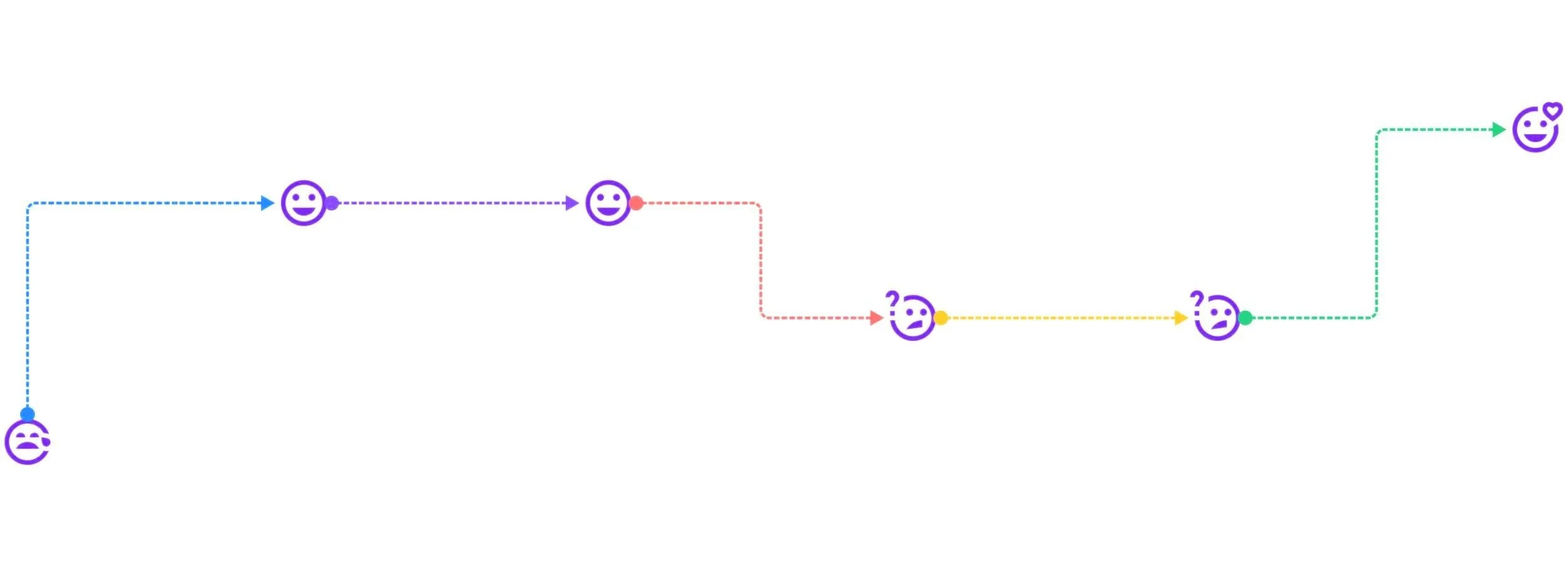
It was becoming evident that providing an automated procedure for the subscription service needed to be in the redesign, but we still had to look at it from the user’s perspective via a User Journey Map. But first, let’s look at the consolidated business problem with key insights and requirements:
Key insights
Profitability – User (Teacher/District) pays for sessions.
User Contribution: User needs to make an account. User needs to pay for a session before getting in touch with the coach.
Business Constraints: Business needs to make the process of scheduling sessions for the coaches easier, so that they can accommodate the sessions into their school day.
Definition of Success: Real-time notifications for the coaches as soon as user books a session. Elimination of middleman (Client) pushing reminders.
Business Requirements
the user journey
As we defined our problem statement for the user, we noted that teachers have time and financial constraints, and they need additional support outside what their districts has provided to meet their professional development goals.
Whereas,
Bmyvillage offers opportunities for growth, but numerous affordable alternatives exist, and users are unwilling to buy into their services offered without district support.
At this point, the two situational inquiries we decided to move forward with were as follows:
How might we show multiple scheduling options so teachers can get support when they are available.
How might we show that Bmyvillage provides customized support for teachers that are superior to random resources online and generalized PD at schools.
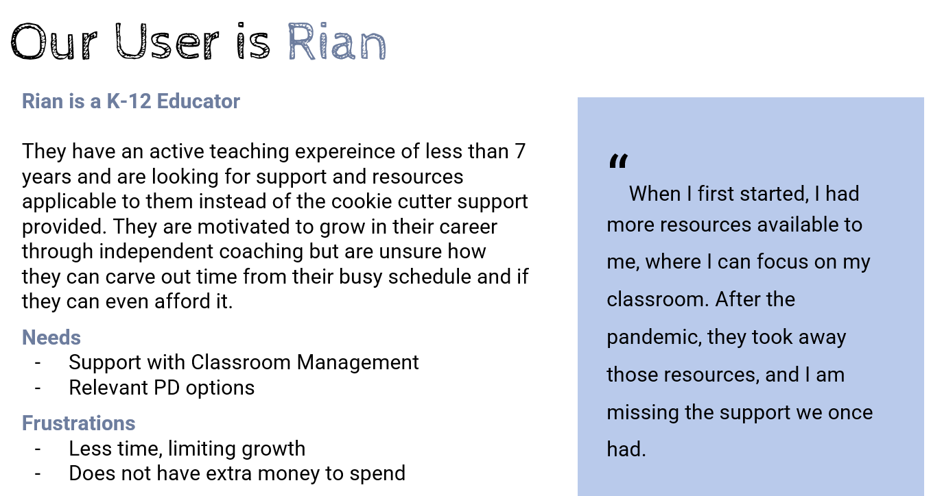
We initially considered two users for the persona. Based on our research there seemed to be a trend within those that were well-seasoned teachers with more than 7 years’ experience versus teachers with less than 7 years’ experience.
For this sprint however, we decided to focus on the newer teacher, that is, one either just stepping into the classroom or with less than 7 years of teaching experience.

the redesign
“Good design is about process not product.” —Jared Sinclair, game designer
With the research phase of our project coming to an end and the problem defined, we now started focusing on the redesign process based on the insights gathered. Initially, we targeted the main pages, the first one being the Homepage of the website, where the new user would get the first glimpse of Bmyvillage and its services.
The modifications intended with the redesign focused firstly on bringing the scheduling services on the top navigation panel for easy access for both new and existing users. Secondly, we wanted to break down the introductory content into retainable chunks of information. Doing so would accomplish the UX Design principle of keeping the layout clearer and more digestible for the user, but it would also cater to the strategy of Differentiation used in education, that is to make content accessible to different styles of learning.
Lo-fi Wireframes
We organized a design studio for sketching out solutions and after discussing the scalability of each sketch, we selected the best ones to take forward into the wireframing phase. The initial designs had the following design goals:
Top Navigation recategorized to show scheduling
Break down introductory content into text, video and images
A singular User Profile page to keep track of user’s PD goals and availability of coaches/sessions
The style guide
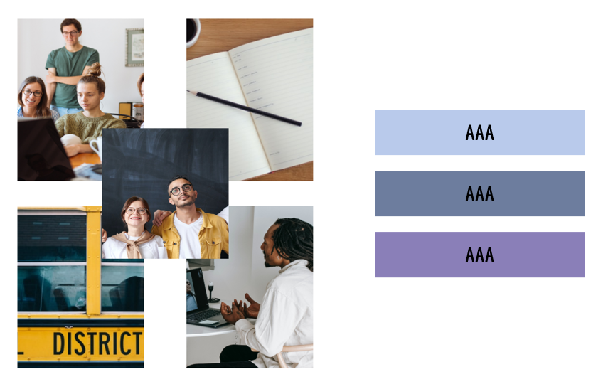
We initially set out to create multiple mood boards because our client expressed interest in a complete redesign of the original website, and after getting her input on which one to move forward with, the following collage was chosen as a reference point for the final design’s style.
Some aspects that were kept under close consideration were selecting images portraying diversity and inclusion and choosing colors that were gender neutral.
Mood board
We also researched on the psychology behind choosing colors for user experience design, especially the emotional association marked with colors. Our final color palette resonated with the idea of ambition, competence and loyalty associated with both the colors Blue and Purple, which related perfectly with the persona of a dedicated teacher.
colors & typography
A similar idea went behind the choice on the selection of the font. We wanted it to give a professional yet engaging look and also to be visually appealing to the reader. The finalized font style is Roboto Flex, it is a sans-serif which is considered readable and legible by universal accessibility standards. It is from Google’s signature font family, and readily available for download from Google Fonts.
Keeping accessibility in mind, the next obvious step for us was to make sure that the font and the color palette pass the website content accessibility guidelines, which deals with the biggest and most common barriers for disabled users. We passed the triple A level check on the contrast between the background and the text colors, which meets the highest level of web accessibility.
content strategy
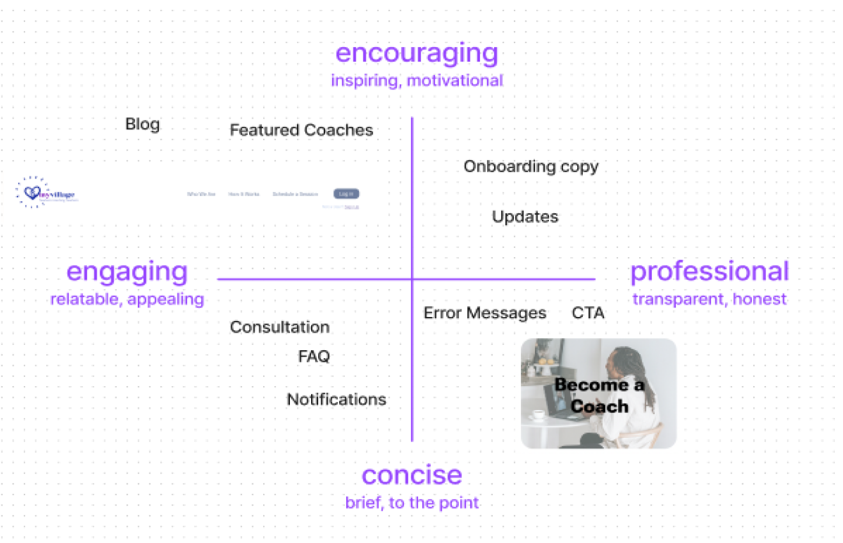
Moving onto content strategy, we decided to rely more on our secondary research in order to set the voice and tone for different context. We looked at how resources were being offered to teachers and decided to keep most of our content focused on showcasing encouragement and professionalism, while also keeping it engaging and to the point.
setting the tone
Encouraging: We inspire and motivate
Professional: We are transparent and honest
Concise: We won’t waste your valuable time with nitty-gritties.
Engaging : We will keep our content relatable and appealing.
For a detailed look at the content guide, click on the Tone Map image above
onboarding
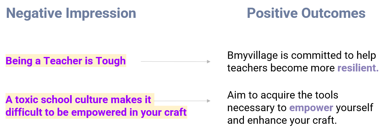
Here is a quick example of how we would use tone mapping as a strategic tool to develop content by avoiding bringing negativity and focusing on encouragement, so as to bring about a more positive and constructive contextual outcome.
usability testing
After the Usability testing of the Lo-fi grayscale frames, a clear pattern and conversation emerged; the prototype was easy to navigate, and we achieved a 93% success rate from 14 testers.
The key insights from the usability testing were:
1 Bad Placement
2 Crowded Design
3 Confusing Scheduling
We already had an idea that the users wanted more information about the coaches before paying for sessions from the first round of usability testing on the current website, and after discussing our options with our client, had incorporated it into the redesign. After the second round of usability testing, it was clear that our user demographic would likely only use the service if their school district provided it or would not pay more than $50 for the session, therefore, giving us a more solid rationale for keeping the district connection feature and a way to claim a free session in the design iteration.
For a complete report on the usability testing, please refer to the Project Figma File. The testing was done using Maze.

the design system
Since our client was looking to implement a complete redesign on the website, it was crucial for us to provide a clear documentation with guidelines, rules and styles that are easy to understand. We wanted to create a design system that could work as a single source of reference for the developers so that consistency and uniformity of design could be achieved across multiple platforms.
Being the design lead for the project, I proposed that we include a pattern library, that is, a larger components library in our design system This would facilitate our client in having “building blocks” of the product handy at all times and available on demand.
For a detailed look at the complete Design System, please refer to the Project Figma File.

The prototype
changes in the design
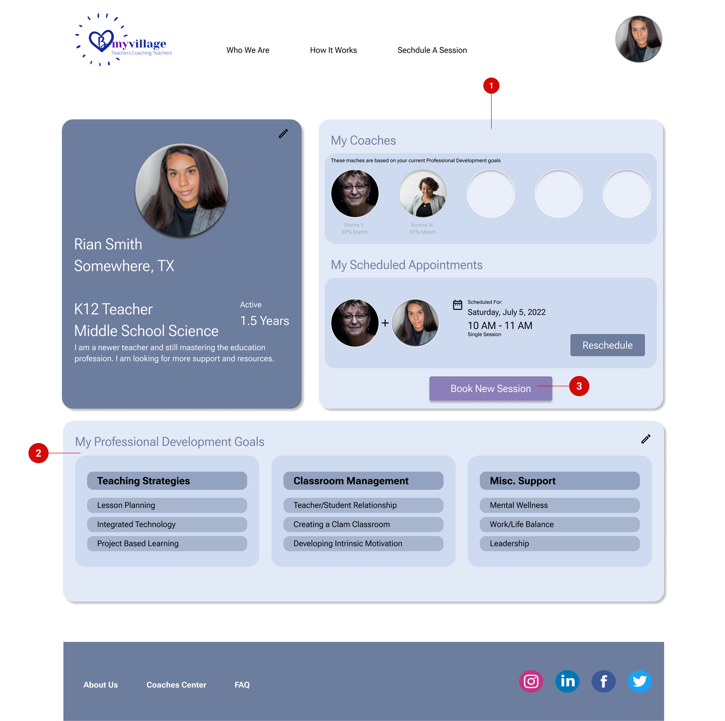
Based on the usability testing results, we made the following changes in the Mid/High-fi prototype:
Changed the hierarchy of the elements to show matches and scheduled appointments first.
Moved the Professional Development goals to the bottom so that it could have more space.
Moved the CTA for new session booking to be in the same element as the appointments for better proximity.
Revamped the scheduling component by using different placements font sizes to show clarity.
Presentation
We presented our project during a 30-minute client/stakeholder meeting with additional time for walking through the Figma file and the handoff documentation. Our objective during the presentation was to share the key research insights, talk about the style guide and design system and ultimately, showcase the prototype.
Below is a video walkthrough and a link to view the final prototype.
The feedback we received from our client was extremely positive, they found our research to be helpful to target the different school districts for onboarding purposes. The redesign was also something our client felt that they could start work on immediately.
Here is a little something our client had to say about me:
“It is a rare combination to have the skills and background that she has. Working with her as a client, I was impressed with how well she embraced the entire UX team she was on to provide me an outstanding client experience. Her diligence, focus, and willingness to listen will make her a phenomenal asset on any team.” — Belinda Medellin, Creator of 1st High School UX Design Courses Globally
Next steps
For the next sprint of this project, we all agreed that we could definitely see ourselves prioritizing work on the following aspects of Bmyvillage:
Customized onboarding for the districts, teachers and coaches.
Create a system of referrals where teachers can get a discount for referring another teacher to use the service.
Incorporate ratings and reviews for the coaches, where teachers can leave start ratings and feedback at the end of a session.
Work on the “Mentor Persona” and focus on deliverables catered towards the pain points of the coaches.

references
Platforms other than Figma used in the project: Material Design, Notion, Maze, Google Forms, Google Slides, Google Sheets, Slack, Canva
Case study build on Squarespace with video elements created using Vimeo. Mockups and other images edited using Figma.


